Here's what I did with the photo app on the first photo of a person I could find in my camera roll...

Yes, the first photo I could find was of Jeremy Renner. Why not?!
ANYWAYS - I had fun with other photos but this was the one I was most confident with to post on Tumblr.
So - with that fun going on, I took a cue from the ABM font post and made my own kinda-sorta versions of their fonts. Kinda sorta
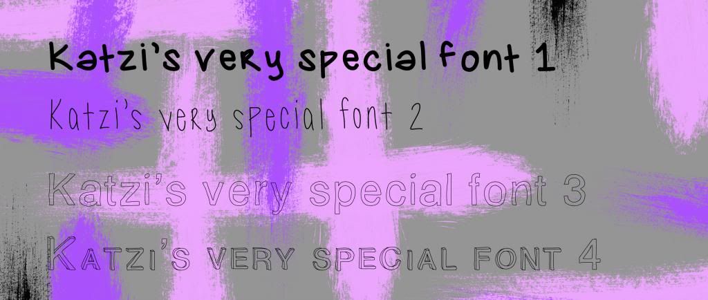
It's obvious that fonts 3 and 4 (Hollow and Stacked, respectively) need to be force-bolded in Photoshop but Photoshop kept reading the numbers and the apostrophe as Myriad Pro - even though I drew those (as you can see).
Font 1 was my experiment with my own handwriting in the app's default brush settings. I might try another version of my own handwriting a little later because this one is clearly a "beginner" font
Font 2 was my take on ABM's font Tall 'n Skinny (but in my handwriting style, of course)
Font 3 was my take on ABM's font LoveLove
Font 4 was my version of hollowed out, slightly altered, "stacked" Helvetica.
I'm currently on the "hate" side of my Love/Hate relationship with Helvetica at the moment. The producer (I guess you could call him...) I work with recently watched Helvetica and now he thinks he's some sort of Typographer. That's okay. What's not okay is having to redo all my keyframe properties so that I can change all my fonts from whatever they were before to Helvetica - even though Helvetica is my "base" font for my text-heavy graphics since it's the most generic but I've been told to not do that (by the "producer") because "that font is SO boring!" (those were HIS WORDS!!)
Then we had this exchange last week:
Him: "Why are we using such a formal font? We need more fun fonts."
Me: "I'm using Helvetica, like you asked me to."
Him: "That's Helvetica? OMG, it's so serious! Okay, we can use it for this round but we need to find something more fun for next time."
MOOD SWINGS MUCH?! Hence the "hate" side of my Love/Hate relationship with the font. Even I haven't seen the documentary! Oh well...
I hope you enjoy my fonts. If I ever update my handwriting one and I like it enough to share, I can set it - or any of the others - up for download, that is, if you really want my weird handwriting...
I'm trying to get my old man to design one as well and I was getting some ideas looking at the Staff Favorites on the 2TTF homepage. I'm definitely going to spend some of my downtime on Behance and on the 2TTF gallery for some more ideas (and downloads!)
How was your weekend? I hope you've seen Man of Steel. It was great! I definitely recommend it in 3D. The special effects are AMAZING!!
No comments:
Post a Comment